
About Me
👋 Hi, I’m Ronald “Ronnie” Gan a Data Analyst & Project Manager
ProfessionalCreating dashboards, automating reports, and improving processes that save time, reduce inefficiencies, and support confident decision-making.My mission: use data and solid execution to drive growth and meaningful results.
Skills

Excel | Tableau | SQL | Power BI
Data Visualization - 1+ year
Business Analytics - 1+ year
Report Development - 1+ year
Project Management - 3+ years
Project Scheduling - 3+ years
Agile & Scrum Methods - 3+ years
Featured Projects
SQL
This project analyzes global COVID-19 trends by integrating case, death, and vaccination data in PostgreSQL to uncover continent- and country-level patterns in infection rates, vaccination progress, and overall pandemic impact.
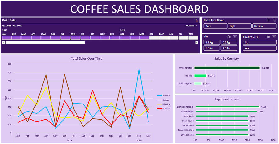
Excel
A deep-dive visualization of 2019–2020 coffee sales, highlighting top performing products, countries, and purchasing patterns.
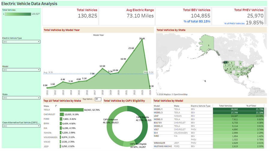
Tableau
This project uses an interactive Tableau dashboard to analyze electric vehicle adoption across the United States, highlighting trends in EV growth, manufacturer dominance, and the distribution of BEVs and PHEVs by state and model year.
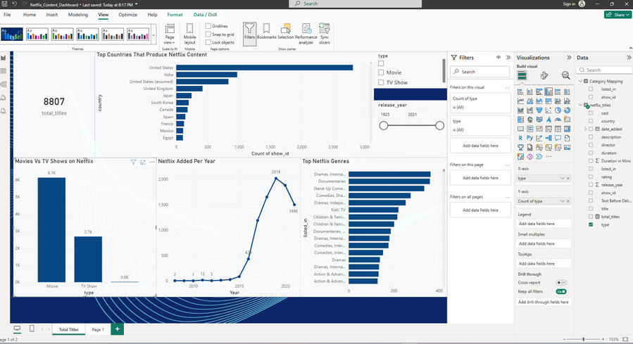
Power BI
In this Power BI project, I analyzed a Netflix dataset to identify trends in content distribution, production locations, and platform growth using data modeling, cleaning, and interactive visualizations.
Professional Certifications
My growing list of certifications
*Click each Icon for Certification

USF Business Analytics Science

Google Data Analytics

IBM Data Analyst

Professional Agile Leadership

Professional Scrum Master
EXCEL
Click Image to go to my GitHub
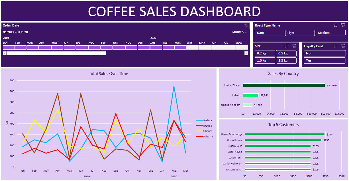
This project explores a multi-year coffee sales dataset (Jan 2019–Aug 2020), using data cleaning, exploratory analysis, and visualization to track product-level sales trends, customer order behaviors, and country-level shipping patterns. Insights support inventory planning, market expansion, and operational optimization.Here are questions I was interested in answering:
1) How did total sales change from January 2019 to August 2020?
2) Which months generated the highest revenue, and why?
3) Which products contributed the most to overall revenue and profit?I took the following steps to create my analysis:
1) Pulling data from Kaggle, cleaning, and prepping for analysis.
2) Creating the pivot tables and charts by utilizing Xlookup, Index Match, IF functions, date formatting, and number formatting.
3) Update pivot tables and the charts.
4) Formatting all sections of the dashboard and creating an overall theme.Here are my key takeaways:
1) The United States Dominates Sales
2) Excelsa & Liberica Are the Top-Earning Coffee Types
3) Customer Purchasing Patterns Are DiverseThe dashboard is completely dynamic and adjusts depending on the month(s) selected above in the bar.
Tableau
Click Image to go to Public Tableau

Using a cleaned electric vehicle dataset from Kaggle, I built an interactive Tableau dashboard to analyze the growth and adoption of electric vehicles across the United States. The dashboard explores trends in Battery Electric Vehicles (BEVs) and Plug-in Hybrid Electric Vehicles (PHEVs), highlighting key market indicators such as total EV registrations, average electric range, and manufacturer dominance. Through geographic mapping, trend analysis, and comparative visualizations, this project provides insights into how EV adoption has evolved over time and which manufacturers, models, and regions are leading the transition toward electric mobility.Here are questions I was interested in answering:
1) How has electric vehicle adoption grown over time based on vehicle model year?
2) What proportion of vehicles are Battery Electric Vehicles (BEVs) versus Plug-in Hybrid Electric Vehicles (PHEVs)?
3) Which U.S. states have the highest concentration of electric vehicles?I took the following steps to create my analysis:
Data Cleaning & Preparation:
- Imported the dataset into Tableau and reviewed the fields to ensure correct data types. Removed unnecessary columns, standardized categorical fields such as vehicle type and manufacturer names, and verified numerical fields, including vehicle counts and electric range values.
Exploratory Analysis:
Identified the most relevant dimensions and measures including state, model year, vehicle make, model, electric vehicle type, and CAFV eligibility. These fields were used to explore trends in adoption, manufacturer performance, and geographic distribution.Visualization Development:
- Developed multiple interactive visualizations to present the analysis:
-- A line chart showing total electric vehicles by model year to highlight adoption trends over time.
--A map visualization displaying the geographic distribution of EVs across U.S. states.
--A bar chart identifying the top 10 manufacturers based on total electric vehicles.
--A donut chart illustrating the distribution of vehicles eligible for Clean Alternative Fuel Vehicle (CAFV) incentives.
--A table/grid view highlighting the top electric vehicle models by total registrations.
--Interactive filters were added for electric vehicle type, state, model, and CAFV eligibility to allow users to dynamically explore the data.I took the following steps to create my analysis:
1) Electric vehicle adoption has increased significantly over time, with the highest number of registrations occurring in recent model years.
2) Battery Electric Vehicles (BEVs) represent the majority of electric vehicles in the dataset, accounting for over 80% of total EV registrations.
3) Certain states show significantly higher EV adoption, highlighting geographic trends influenced by policy incentives and infrastructure availability.
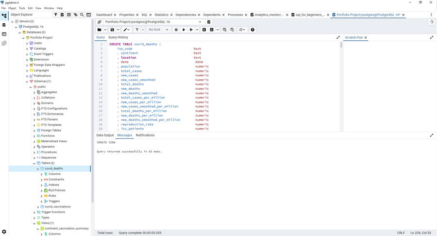
SQL
Click Image to go to my GitHub
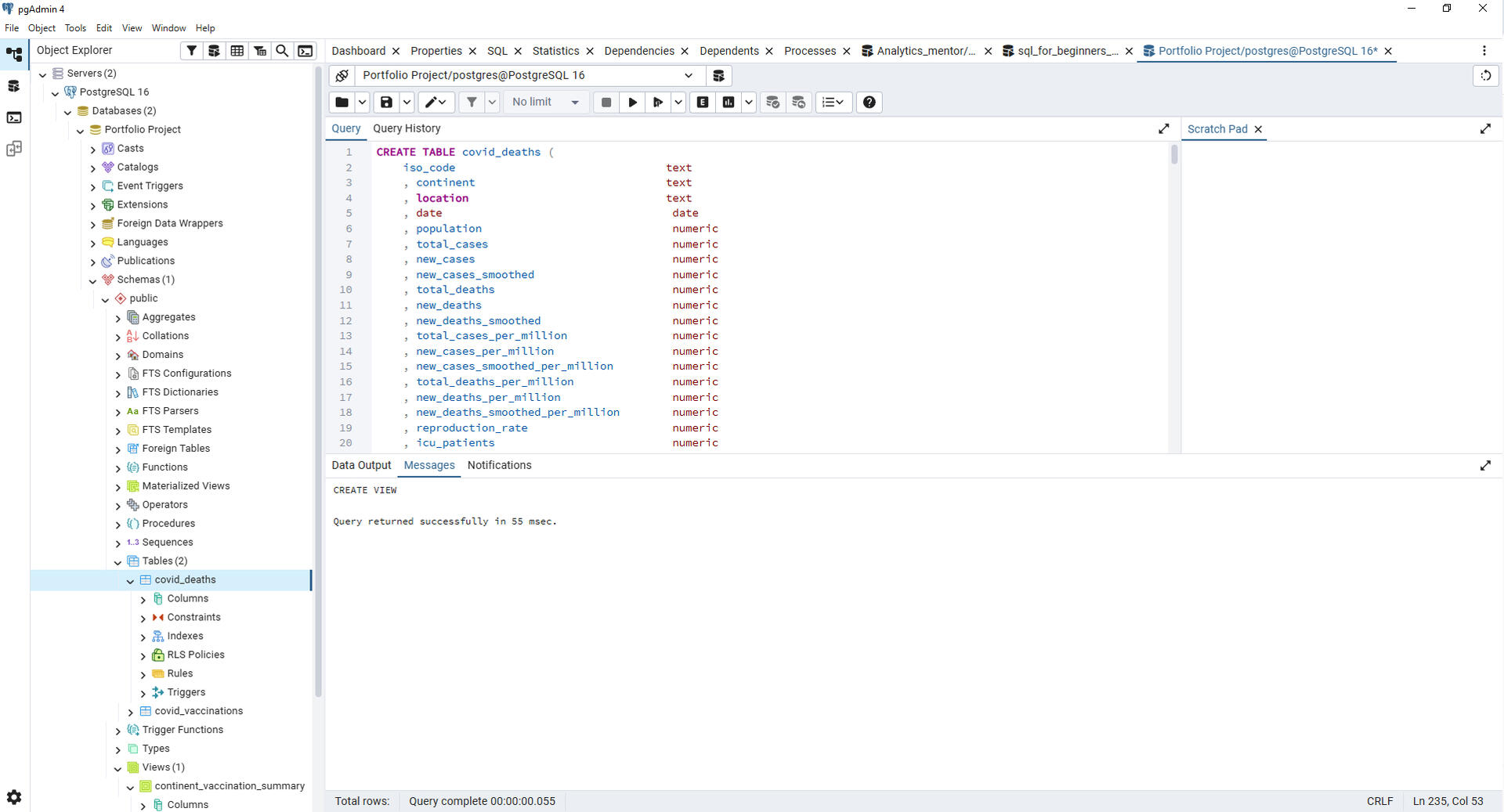
In this SQL project, I explored global COVID-19 trends by analyzing cases, deaths, population impact, and vaccine progress. Using joins, CTEs, and window functions, I built queries that revealed how the pandemic evolved across regions and how vaccination rates influenced outcomes.Here are questions I was interested in answering:
1) How did COVID-19 case numbers, deaths, and recoveries change over time across different countries and regions?
2) Which countries experienced the highest infection and mortality rates relative to their population size?
3) What patterns or correlations exist between vaccination rates and changes in case trends?I took the following steps to create my analysis:
1) Data Cleaning & Preparation:
- Checked for missing values, inconsistent date formats, and duplicate rows.
- Standardized country names and converted string-based numeric fields into integers/floats.
2) Exploratory Structuring:
- Identified key tables (cases, deaths, vaccinations, population).
- Joined tables using country and date fields to create a unified analysis dataset.
3) Query Development:
- Wrote aggregate queries to calculate daily and cumulative totals.
- Used window functions to analyze trends and moving averages over time.
- Applied GROUP BY and JOIN logic to break down results by country, region, and population.Here are my key takeaways:
1) Countries responded differently, resulting in large variations in case growth, mortality rates, and recovery outcomes.
2) Vaccination rollouts showed a strong impact on slowing new case growth in many regions once high coverage was reached.
3) SQL is powerful for large-scale time-series analysis, especially when combining multiple datasets with JOINs, CTEs, and window functions.
Power BI
Click Image to go to my GitHub

In this Power BI data analysis project, I explored a Netflix content dataset to analyze trends in streaming content distribution, production geography, and platform growth over time. Using Power BI’s data modeling and visualization tools, I cleaned and transformed the data and built an interactive dashboard that reveals how Netflix’s content library has evolved across genres, countries, and release periods.Here are questions I was interested in answering:
1) How has Netflix’s content catalog grown over time based on titles added each year?
2) What proportion of the platform’s library consists of Movies vs TV Shows?
3) Which countries and genres contribute the most to Netflix’s global content catalog?I took the following steps to create my analysis:
1) Data Cleaning & Preparation (Power Query)
- Loaded the dataset into Power BI Desktop and used Power Query to clean and transform the raw data.
- Corrected data types and standardized fields such as dateadded, releaseyear, and rating to ensure proper analysis.
- Removed unnecessary fields and handled missing values to improve data quality and usability.
- Applied transformations within Power Query to structure the dataset for aggregation and visualization.
2) Exploratory Data Analysis (EDA):
- Explored the dataset to understand the distribution of Netflix content by type, country, genre, and release year.
- Created summary metrics to identify trends in content production and platform growth.
- Analyzed patterns in how Netflix’s content library expanded across different time periods.
3) Data Visualization:
- Built an interactive Power BI dashboard with KPI cards, bar charts, and line charts to highlight key insights.
- Designed visuals showing Movies vs TV Shows distribution, top content-producing countries, genre breakdowns, and content growth trends.
- Implemented interactive filters and slicers allowing users to dynamically explore the data by year, genre, and content type.Here are my key takeaways:
1) Netflix’s content catalog expanded rapidly between 2016 and 2020, reflecting a major growth phase in the platform’s global streaming strategy.
2) Movies dominate Netflix’s content library, making up the majority of titles, while TV Shows represent a smaller but steadily growing portion of the catalog.
3) Content production is highly globalized, with countries such as the United States, India, and the United Kingdom contributing significantly to Netflix’s available titles.
Thanks!
Thank you for taking the time to visit my portfolio!If you'd like to chat about me joining your team, feel free to email me using the form below 👇🏽